Friday, August 01, 2008
Linear Pet Peeve
Almost every plot of financial data I see these days is plotted with a linear y axis. Almost none of them should be. This is not a minor point--it often changes the impression (which is all that a graph is there to deliver) entirely. If anyone has any idea how to effectively start a campaign to rid the web of rogue linear axes, let me know.
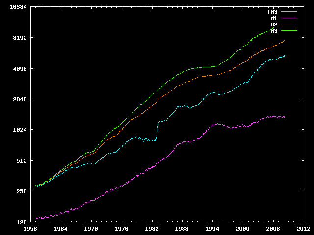
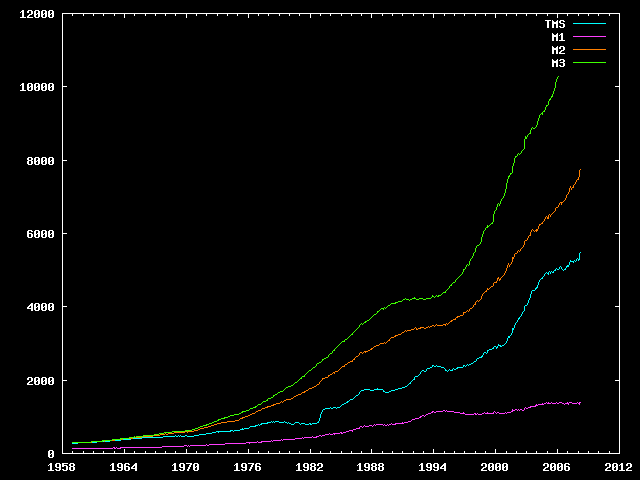
To wit, mises.org publishes this typical graph of the money supply:
Which really ought to look like this: